
Design
Have trouble deciding on what you want or aren’t sure how to make your idea look amazing on paper? Have us design it for you!
Submit Artwork
Once you have your ideal look and know what product you want to show it off with, send it over and we will make sure it looks perfect on your next project.
The process will take anywhere from 1-7 days to get the product to your door!
Frequently Asked Questions and Info
For products that will be perfect bound, we do not recommend crossover images and/or copy, as these elements may be lost in the gutter and may not line up after binding.
High-quality images can be obtained from:
High-resolution stock photography
High-quality scanned images
Digital cameras with a high quality of 2.4 mega pixels or more
Remember – DO NOT take any images from the Internet, because most images you will find on the web are protected by copyright laws, and these images are not high resolution
Monitor resolution is much lower than the resolution of printers, so just because an image looks sharp on the screen, doesn’t mean it will print well.
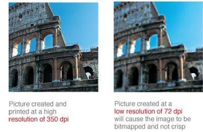
If purchasing an image from a royalty-free website, please make sure that you choose a high-resolution image of 350 dpi.
Your original file needs to be created at a resolution of 350 dpi (150 dpi for signage). If a file is created at a low resolution and manually changed to a higher resolution, it will not change the quality of the image. The only difference it would make is that the file would be rescaled, and the density of the pixels or dots would change, not the number of dots or pixels in the file.
When you take a picture from a digital camera, it must be set at a high resolution in order to result in 350 dpi. We recommend you do this because you cannot change the resolution of a picture after it has been taken. Whenever you change the dimensions of an image or picture, the resolution changes also. The more you reduce the dimensions of a picture, the higher its resolution becomes. For this reason, we ask that you make sure that you save the picture at 350 dpi.
Image resolutions can change if the image is resized or scaled in the page layout application, or if the image is resized or scaled when the file is converted to the PDF format.
In order for an image to print correctly, all file formats must be submitted at a resolution of 350 dpi at 100% of the final print size. When file resolution is lower than 350 dpi, the final print will have a substantial drop in the image quality. For signage, please submit files with a resolution of 150 dpi.
A resolution of 350 dpi means 350 dots per every inch in the design.
Resolution is also known as dpi (dots per inch) or ppi (pixels per inch). It indicates the number of colored dots or pixels that make up one image. The higher the dots per inch/pixels per inch, the greater the resolution and the clearer the resulting final print will be.
LPI, or lines per inch, is a measurement of resolution that uses a halftone screen. LPI measures how close together the lines are in this halftone grid. The higher the lines per inch (or the closer the lines are together), the better and clearer the image will be. In order to determine the appropriate image resolution needed for print, the combination of your printer’s DPI and the required LPI must be observed. Whereas the DPI determines the number of dots per inch, the LPI is also needed in order to determine the frequency of the lines containing the dots, per inch of the halftone grid. Once these two elements are calculated, the correct resolution can be determined. The image usually must have 1.5 to 2 times as many dots per inch as lines per inch. Center City Print prints with 200 lpi for high-quality, beautiful, final prints.
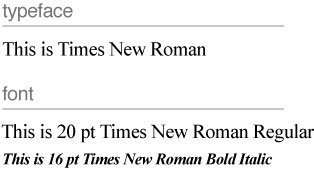
In typography, a typeface is the design of the set of characters. Times New Roman is one typeface, Arial is another. There are many different categories of typefaces, including: Roman (Serif, Sans-serif, Script, Ornamental), Blackletter, Gaelic, Monospaced, Symbol.
A font is a set of characters in a particular size and typeface. For example, within the typeface Times New Roman, is a series of fonts. Times New Roman in 20 pt. is a font, and Times New Roman in 16 pt. is another font. Times New Roman in 16 pt., Bold and Italic is yet another. In other words, a font is a member of a typeface family, and designates the size and style of the typeface.
Please follow the following steps before you submit your files.
- Fonts must be embedded in PDF files. (Some fonts have copyright restrictions and will not embed in PDF Files.)
- Embed all images and outline text in Illustrator files.
- Quark Express: Fonts and images must be included with all files submitted. (Mac only)
- Flatten all layers when working in Photoshop.
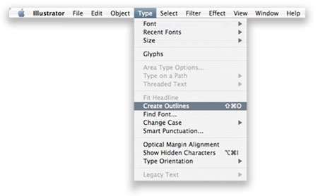
When creating a file with a vector-based software such as Illustrator, follow these steps to outline fonts:
- Select “Type”
- Select “Create Outlines”
When trying to outline fonts in Photoshop, simply just flatten the image.
Embedding a font means storing your font information in the file so that when your file is opened on a different computer, the fonts do not vary in appearance. If your fonts are not embedded, a different font may be substituted for your document. To prevent these variations, embed all your fonts in PDF files.
Decorative typefaces, also known as ornamental or display fonts, are embellished typefaces with unique proportions and shapes. These shapes and proportions reinforce the message or theme behind the words. Decorative typefaces are a popular choice for artistic work and are a vital element of a great design. They are intended for decorative purposes such as for headings and titles, and are generally not suitable for body text.
There are numerous types of decorative fonts, including Amazone, Brush Script, and Apple Chancery, seen in the example below.
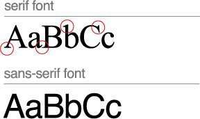
Serif and Sans-serif are typefaces that are commonly used for body text. Serifs are the smaller lines on the main strokes of letters and numbers. The structure of the serifs is considered less harsh for reading large body of text, which is why newspapers and books often use this type of typeface.
A typeface without serifs is called Sans-serif (the word “sans” is French for “without”). Sans-serif typefaces are commonly used for electronic media. Since the computer screen has lower resolution compared to printed material, Sans-serif fonts are easier to read and follow than Serif fonts.
Maximum file size for uploads: 100MB (megabytes) per file.
Before uploading your file, make sure to check the image size. In Photoshop, click on Image > Image Size, and proportion your image correctly.
Recommended: To reduce file size, please upload in .jpg format. For all other file formats, ensure all layers are flattened.
There really isn’t a difference between a .TIF and a .TIFF, or a .JPG and a .JPEG, except that one uses an extension with three letters, the other with four. The files are the same, and will remain the same even if you change the file from the three-letter extension to the four-letter extension. For example, if you change a .TIF to .TIFF, the file will still open up the same; the only difference will be in the file name.
The two different file extensions for the same file type derived from Windows, which required files to have a file extension of no more than three letters. Thus, the original .TIFF files were abbreviated to .TIF to meet this requirement. Macintosh platforms, however, did not limit the file extensions to three letters, since the longer the extension meant the more descriptive. This is why Macs use file types with four extensions.
The following formats are acceptable for uploads: TIF, .TIFF, .EPS, .AI, .PSD, .BMP, .GIF, .JPG, .PNG, .PDF. Recommended: To reduce file size, please upload in .jpg format. For all other file formats, ensure all layers are flattened.
- TIF (Tagged Image File) – High-quality graphics format that is often used for storing multi-colored images. Supports layers, multiple pages, raster images, vector images, lossy compression, and lossless compression.
- TIFF (Tagged Image File Format) – High-quality graphics format that is often used for storing multi-colored images. Supports layers, multiple pages, raster images, vector images, lossy compression, and lossless compression.
- EPS (Encapsulated PostScript) – PostScript file used primarily in the transfer of images to different operating systems.
- AI (Adobe Illustrator file) – Vector graphics file that uses paths connected by points.
- PSD (Photoshop Document) – Image file created by Adobe Photoshop; supports various types of Photoshop image options, including image layers, adjustment layers, etc. We recommend that .PSD files be flattened prior to being uploaded.
- BMP (Bitmap) – High-quality graphics format which allows it to produce large file sizes and uses image compression algorithms that can decrease file size.
- GIF (Graphics Interchange Format) – Uses lossless compression that may not degrade the quality of the image. GIFs store image data using indexed color, with a maximum of 256 colors.
- JPG (Image Compression File) – Compressed image format that uses lossy compression; commonly used for storing realistic photos (digital photos), since it is able to compress substantially with minimal loss in image quality.
- PNG (Portable Network Graphics) – A bitmapped image format with lossless data compression. Gradients come out smoother and do not have the distortions that may appear in a .JPG. Used mainly for archiving files. Does not support CMYK.
PDF (Portable Document Format) – The most preferred file format to be set in pre-press quality. Ideal for viewing on multiple computers, because it preserves the formatting, fonts, and other elements within the document on different computers, as well as when it is printed.

A vector image is an image made up of lines and curves that are stored as mathematical formulas, and can be moved freely or modified without losing detail or clarity. Whereas a bitmapped image will lose clarity when rescaled, the vector graphic can be scaled indefinitely without losing clarity.
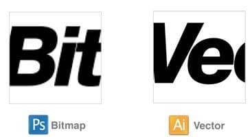
The example below shows the effect of a bitmap graphic versus the vector graphic. When zoomed in, the bitmapped image appears jagged, whereas the vector graphic appears clear and crisp.
Bitmap means a map of bits (or pixels) that form a picture. Thus, a bitmapped image is an image comprised of pixels. Though bitmaps store images in high resolution, they do not rescale very well, and tend to appear jagged when zoomed in, and blurry when reduced in size. Bitmaps are ideal for storing digital images. Whereas a bitmapped image will lose clarity when rescaled, a vector graphic can be scaled indefinitely without losing clarity.
The example below shows the effect of a bitmap graphic versus a vector graphic. When zoomed in, the bitmapped image appears jagged, whereas the vector graphic appears clear and crisp.
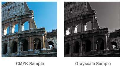
Both CMYK and RGB color scales render colors differently due to the process of mixing colors and how much mixing is needed. Colors need to be converted correctly in order to meet the correct color profile, depending on the medium. Since RGB has a larger scale of available colors, this scale may work better to produce specific colors that are vibrant, depending on the product. In print mediums, RGB colors will not be as vibrant as they appear on-screen. CMYK colors are more accurate on screen and in print because it has a more limited range of possible colors. Both color modes must be properly converted using various design softwares in order to produce true colors. Colors viewed both on screen and in print mediums will vary.
RGB indicates Red, Green, and Blue and is primarily used for electronic and photography purposes. These 3 colors combined in various percentages create any color in the visible spectrum. Various products use RGB because it offers the widest range of colors.
Grayscale color mode, also known as black and white color mode, is composed of two colors: black and white. It is used to reproduce an image with different shades of grey.
A computer monitor represents only one form of black. In print, there are several ways to represent black, including “rich black.” Rich black is a darker, deeper black that combines a percentage of all the four CMYK inks. The values to create rich black for coated stocks are: C = 30, M = 30, Y = 30, and K = 100. The values to create rich black for uncoated stocks are: C = 20, M = 20, Y = 20, and K = 100. For gray densities, we recommend that the file have the following color values: C=10, M=10, Y=10. For the K value, anything under 100 would be considered a gray.
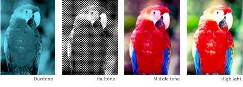
Continuous tone imagery contains an infinite range of shadows and mixed colors.
Duotone: Halftone reproduction of an image using 2 colors.
Halftone: Continuous tone imagery through the use of dots.
Middle tone: Tone in an image conveyed by highlights and shadows.
Highlight: Lightest part in the image.
It is imperative that you convert your files to CMYK, since this is the only color mode that we accept for printing. Any other color mode will not produce optimal printing results. Most commercial printers accept RGB images; however, using images that are in RGB color mode may ruin the appearance of the final printed material.
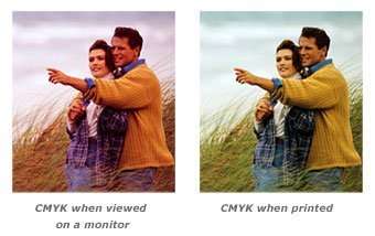
RGB color mode combines three colors, Red, Green, and Blue. Your computer monitor, scanner, and digital camera all use a combination of these three colors to produce the final colors. Presses, however, require four different colors, CMYK, to produce the final printed material. Thus, RGB must be converted to CMYK for print.
You can convert a file from RGB to CMYK, but cannot convert a file from CMYK to RGB. If you attempt to do so, some of the image data in that file may be lost and become unrecoverable.
Keep in mind that your image may be created in RGB, but it will print in CMYK.
RGB color mode may look sharp on your computer screen; however, it will not print as it appears.
Convert RGB files into CMYK in Photoshop by simply clicking on Image > Mode > CMYK.
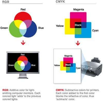
Four color process is a method of printing that uses dots of cyan, magenta, yellow, and black to recreate the continuous tones and to produce a printed image that matches the coloring of the original image.
CMYK indicates Cyan, Magenta, Yellow, and Keyline (Black). These 4 colors of ink are used for offset printing. Cyan is a shade of blue found in the 4 primary color printing process. Magenta is a shade of hot pink found in the basic 4 color printing process.
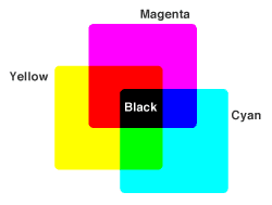
We require that you provide us with print-ready digital files in CMYK or RGB color mode depending on the product type. Provide all black and white artwork in grayscale color mode. We do not accept any other color mode.
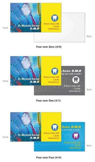
Color options for pre-press printing are divided into three categories:
Full Color Front/Full Color Back, or Four over Four (4/4): Four-color print job with color on both sides of the paper.
Full Color Front/Grayscale Back, or Four over One (4/1): Full-color print job on the front, and black and white (grayscale) on the back.
Full Color Front/Blank Back, or Four over Zero (4/0): Four-color print job on the front, and no printing on the back.
To achieve a matching background color to that of your logo, e.g. a logo that is a square and has a black background color that needs to be placed on 2″ x 3.5″ business card template, please do the following:
Open your logo in your design program (likely Adobe Illustrator or Photoshop). With the Eyedrop tool, click on the background color of your logo – in this case it will be black per the example above. Write down the CMYK percentages of the black that you just sampled.
One example would be C=0, M=0, Y=0, K=100. (Standard 100% Black) Another example would be C=40, M=30, Y=30, K=100. (Four-Color Rich Black)
Once you’re in the Advanced Designer software, and prior to placing your logo, fill in the background color using the percentages you wrote down which are those of your background logo. This will ensure that there won’t be two different shades of black when your cards are printed.
This method is the same for other colors as well.
Borders are not recommended due to cutting shifts. If your product is not trimmed exactly on the trimming line, borders may appear uneven. Especially for small products such as business cards, even half a millimeter of cutting shift may cause the borders to look uneven.
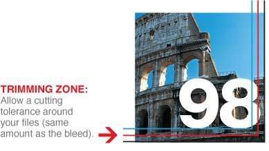
The Trimming Zone, or the trim line, is where the product will be trimmed to its final size. The trim line indicates the final size of the product. Please keep in mind that variations may occur during the trimming process, and we cannot guarantee that your product will be trimmed perfectly along the trim line.
The Safe Zone is the area where all the critical elements (text, images, logos, etc.) must be placed, so that they are not trimmed off when the product is trimmed to the final size. Please make sure to remain within the Safe Zone, as elements on the Safe Zone line may be cut off during trimming.
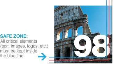
Image Area is the area of the artwork that will appear on the final print.
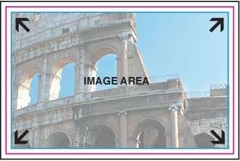
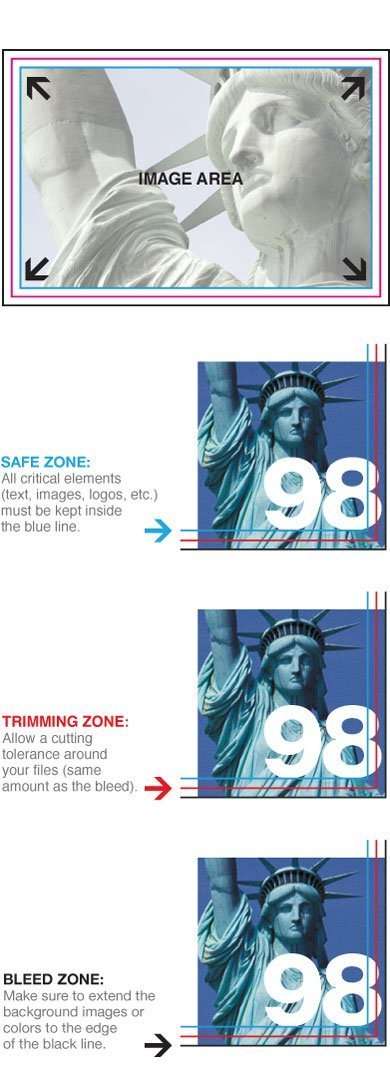
It is helpful to use guidelines in your artwork for print-ready files. Guidelines such as the safe zone, the trimming zone, and the bleed help designate where your product will be trimmed, as well as help you keep important elements such as text and graphics away from the trimming margin. Please provide us with a bleed all around your artwork, and make sure to keep all critical elements such as text and graphics within the Safe Zone.
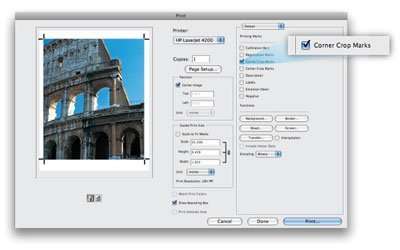
Crop marks are lines on the design that serve as a guide for where the image or product will be cropped. To create crop marks in Photoshop, follow the steps below:
- Open your file in Photoshop
- Choose File > Print
- Select “Output” from the drop-down list on the pop-up menu
- Check off “Corner Crop Marks”
- Click “Print”
You may submit your files with crop marks that are added outside of the design itself, but please ensure that crop marks are not within the design, as we will not remove the crop marks from the design.

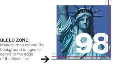
In printing terminology, the bleed is the extra margin on a print product that is meant to be trimmed off when the product is trimmed to its final size. Bleed basically means that the color and graphics on a product “bleed off the page” to ensure continuity of the color to the edge of your product. For the best results, please download the product templates from our download templates page.
When we print products such as business cards and postcards, we do not print on paper of that size. We gang-run print, which means that we organize several print jobs next to one another on a large sheet of paper, print, and then trim each individual product to its final size. Jobs cannot be trimmed perfectly on the trimming line each time. During the trimming process, a product may be trimmed within or beyond the trimming line. As a result, the product may have a white edge, or a portion of the artwork from the surrounding jobs. Thus, we require a bleed on each individual product so that when the product is trimmed. This is an extra margin to prevent imperfections.
A full bleed is required for all print-ready files. For the correct bleed for your product, please view the list below. For example, most business cards have a 0.1″ bleed, so a 2″ x 3.5″ business card without round corners will have a bleed size of 2.1″ x 3.6″.
0.1″ bleed: most business cards, folded business cards, bookmarks, CD packages, club flyers, collectors cards, DVD packages, event tickets, most postcards, rack cards, rip business cards, rolodex cards, stickers, table tents, greeting cards, “wink” special shapes.
0.125″ bleed: a-frame signs, banners, brochures, door hangers, envelopes, flyers, folded hang tags, hang tags, illumaprint panels, letterheads, mini menus, notepads, posters, Large Format Posters, roll labels, retractable banner stands, staggered cut flyers, window clings, window decals, yard signs.
0.25″ bleed: booklets, calendars, catalogs
0.3″ bleed: folders
0.325″ bleed: business cards with round corners in either 2” x 3.5” and 3.35” x 2.17” size. Postcards with round corners in the following sizes: 4” x 6”, 5.5” x 8.5”, 4.25” x 5.5”, 5” x 7”. All special shapes, except for “wink” special shape, which is 0.1″.